#LovingTheBurg with Benny Zhang

In this edition of #LovingTheBurg, Gretchen sits down with city council member and community leader Benny Zhang to discuss local politics, community growth, and why he cares so much about the future of Williamsburg. 

In this edition of #LovingTheBurg, Gretchen sits down with Williamsburg City Council member Benny Zhang to discuss Williamsburg, political life, and why he's #LovingTheBurg.

When speaking about the community of Williamsburg Benny had this to say, "One of the first things that struck me is how nice the folks are here."  

#LovingTheBurg with Paul Crapol

In this edition of #LovingTheBurg, Gretchen sits down with local vegan and mindfulness teacher, Paul Crapol to discuss veganism, politics, and why he loves calling Williamsburg home. 

In this edition of #LovingTheBurg, Gretchen sits down with local vegan Paul Crapol to discuss veganism, mindfulness, life in Williamsburg, and why he loves calling the Burg home.

When discussing one of the things Paul loves most about Williamsburg he says, "I like meeting new people... and Williamsburg is great because you can strike up a conversation with people."

#LovingTheBurg with Robert Hodge

For this edition of #LovingTheBurg, Gretchen sat down with Robert Hodge from Williamsburg's premier radio station WMBG FM 97.7 to discuss radio, music, and all things Williamsburg. 

During this edition of #LovingTheBurg, Gretchen sits down with radio personality Robert Hodge to discuss radio, Williamsburg VA, and why he's loving the 'Burg.

While discussing that moment he knew he was in the right place, "It's funny they showed up to the studio and I bought some cereal and we had breakfast together. And they sang and played, and we just had a blast together. All of a sudden I realized I really am in a dream position. And I thought, how did I get this lucky?" 

Check out the rest of the interview to find out more of Robert's thoughts and revelations on radio, music, and life in the 'Burg.

Video For Your Business

We receive questions, almost daily, from business owners and entrepreneurs who are considering video for their business or startup. They often want to know what goes into the video production process and what they should be looking for when picking a video production team. After helping our most recent client through this journey, we decided it was time to make a video of our own to help you as you embark on the process of video for your endeavor. No matter where you are in the process, be it still hunting for your dream team, or anxiously waiting for shoot day, we've got your covered with all the tidbits and tips to make the experience as enjoyable and productive as possible. 

To find out more about how Odd Moxie can make you look good, give us a call: (757) 561-0779 or send us an email: info@oddmoxie.com 

#LovingTheBurg with Andrew Langer

For this edition of #LovingTheBurg, Gretchen sat down with Andrew Langer of the Langer Cast to discuss all the amazing places he's discovered in Williamsburg, military family life, and why he's been loving Williamsburg, VA since his youth. 

Andrew Langer by Odd Moxie - smaller.jpg

When describing his perfect Williamsburg Saturday with family, Andrew says, "If I had to start a perfect Saturday it would start with the Farmers Market. Then a trek out to the winery for lunch. Then in the afternoon a trek out to one of the beaches on the Colonial Parkway. And in the evening something cultural." 

To hear more about his family's adventures in the Burg check out this edition of #LovingTheBurg! 

The #LovingTheBurg crew sat down with Andrew Langer, of the Langer Cast Radio Show, to find out more about him and why he's loving Williamsburg, VA.

#LovingTheBurg at Copper Fox Distillery

After speaking with Erin we were able to gather around Copper Fox's signature bathtub fire to talk with Rick, owner and distiller of Copper Fox. He shared with us why he chose Williamsburg as the spot for the second Copper Fox Distillery, the first is located in Sperryvillle, Virginia. 

"Why not Williamsburg? Could you think of a better city? It's got the perfect location, it's beautiful, the people are great, and there's this wonderful spot that use to be a hotel that has all these cool buildings that are just oozing with character."

Check out the rest of the Boss Lady's interview with Rick, as well as our other podcasts over on SoundCloud. 

#LovingTheBurg took a trip to Copper Fox Distillery in Williamsburg VA and had the opportunity to chat, briefly, with owner Rick.

Are you #LovingTheBurg? Do you or your business want to be featured in our #LovingTheBurg segment? Email Rayven at rayven@oddmoxie.com to receive details on how to get your #LovingTheBurg closeup. 

Playing with the Sony A7RII

Playing with new gear is a great way to stretch creatively.  New equipment can interrupt the autopilot systems we have in place when we pick up our “daily driver” camera.  I would never take gear I hadn’t used out to a client shoot, but it's great fun to experiment and play on my own time.  And sometimes I discover a new or interesting way to work that brings a fresh perspective to client work.

In light of keeping the creative muscle strong and flexible, I rented the Sony A7RII and I spent the weekend playing with it.  

First thing, it takes a lovely photo.  

Some of that is the glass I mounted on the front (don’t cheap out on your lenses, it never does you any good.)  I had a range of quality lenses to play with all connected by a Sony E to Canon EF adaptor.  The Tokina 11-16mm (super wide) was fun, but ultimately impractical for what I like to shoot.  I also threw the Canon 70-200mm on the body.  I would have thought to would have made the camera feel like it was going to rend itself in half since it's such a big lens, but really, the Sony is has a sturdy body and the physicality of the whole thing worked well.

Ultimately I found myself just leaving the Canon 35mm on for a more compact, on-the-go, experience with the camera.  It was agile, which is a great change from my regular rig.

Second - it can have an entirely silent shutter, which would be great on set. I did find the shutter button to be enthusiastic and I got two or three shots for everyone I intended to get.  Again, that might be what I’m used to.

This camera would be perfect for someone who likes to do street photography or someone who is used to setting up a shot in their phone.  It would also work well for someone who’s mobility isn’t what it used to be.  The display on the back of the camera is large and pivots out so you can hold the camera low or high, and still angle the screen so you can set up your shot.  I found I spent much of the time with the camera putting it in strange positions without having to guess if I got the shot or contorting my body to look through the viewfinder.

As for the viewfinder, it’s digital, and I didn’t like the way it looked.  Compared to the viewfinder I usually look, though (on a traditional mirrored DSLR) I found it to be grainy, unsatisfying, and hard to make sure I had it my focal point or exposure.  Because of that, I found myself using the back display which gave me a very different physical experience with the camera.

This was a fun rig to play with, and my family has been on the hunt for a good vacation/adventure camera.  This one might be it.  It takes video (Ryan will be happy), the camera is responsive and still gives you control over your shot, all while being compact and portable.  A big difference from my (exceptionally well loved and used) Nikon 700 with a battery pack and either the Nikon 24-70mm or the Sigma 70-200mm strapped to the front. (It's a bit of a beast, but it takes a hell of a photo.)

#LovingTheBurg at Copper Fox Distillery

For our first installment of #LovingTheBurg, we loaded up the Odd Moxie van and headed to the Copper Fox Distillery. What started out as a chilly afternoon questioning our original plan, turned into a lovely evening by a bathtub fire sipping spirits crafted in Williamsburg. 


The first face we met at Copper Fox belonged to the lovely Erin. Erin bravely popped the cherry on #LovingTheBurg by telling us a bit about what brought her to the Williamsburg and the Copper Fox, as well as why she's #LovingTheBurg. 

"I use to bartend at a local restaurant and the girl I bartended with knew Rick's business partner. She started working here, I was working on a farm and needed a change so I came here to learn something new. Williamsburg is a beautiful town, the food scene is awesome, and it has lots of good people."

Are you #LovingTheBurg? Do you or your business want to be featured in our #LovingTheBurg segment? Email Rayven at rayven@oddmoxie.com to receive details on how to get your #LovingTheBurg closeup. 

#LovingTheBurg with Odd Moxie

We all love the Burg. With its blend of history and modern life, there’s always something to do if you know where to look. Which is why Odd Moxie is on a mission to learn what everyone who comes to the Burg loves about this old trendy city that we call home. Check back here, as well as on our Facebook and Instagram pages, every week to see what community members and visitors we’ve spotted around Williamsburg have to say about why they’re #LovingTheBurg.

Brunch with the Boss Lady

At Odd Moxie, we love our clients, community, and creative industry. Taking a cue from Gary Vaynerchuk, we're showing love and shining a spotlight on some of the talented people we've been fortunate to meet through the years. In Brunch with the Boss Lady, you'll meet some of Odd Moxie's clients, Williamsburg and Hampton Roads movers and shakers, as well as folks who make the world a better place behind and in front of the camera. 

For our first podcast, the boss lady sat down with the man behind her signature hairstyle and the mind behind Williamsburg's premier drag show, Robert Kyle.  

The #BossLady sits down with the man behind her signature purple hairstyle, as well as Williamsburg's priemer drag show.

Are you interested in being on Brunch with the Boss Lady? Email us at brunch@oddmoxie.com! 

Storytelling and The Nightmare Before Christmas

“Every story has a beginning, a middle, and an end. Not necessarily in that order.” - Tim Burton

No matter the order, quality storytelling pulls you in and immerses you in the design being created around you. From digital to visual storytelling each follows five fundamental elements which we’ll explore the Halloween classic The Nightmare Before Christmas.

With our first panorama of the forest, the scene is set for worlds beyond our own. Worlds that live hidden behind holiday themed doors. The music creates an air of intrigue as the narrator's voice booms in beckoning us through the door into Halloween Town. The screen engulfs in black, aside from a lone jack-o-lantern, and the chords for "This Is Halloween", The Nightmare Before Christmas' signature song begins. We fall into the setting and become part of a world that reveals its cast of characters with each cheer of “This is Halloween”.

As subplots unfold around us, we plunge deeper into the world of Halloween Town and are invited into the heart of the undead Jack Skeleton.  We’re no longer spectators to a story being told by an unseen narrator. Instead, we're a living extension of the feelings invoked by the cast of characters as they effortlessly create the mood of the story through their heartfelt soliloquies and interpersonal dramas. We become invisible as we entangle with the story. Jack’s first time in Christmas Town becomes our first time as the emotions overtake us we feel his joy, curiosity, and desire.

The subplots move along in conjunction with the central plot, a mirrored dance of emotions, we relate to Sally’s need to be heard and free along with Jack's need to meaning in his work. When Christmas night approaches we fear for Jack, Santa, and the unsuspecting residents of Christmas Town. The story moves along with the grace of a seasoned gravedigger, digging us deeper into the world crafted by Tim Burton. With each roll of his dice, Oggie Boogie becomes the embodiment of all of our nightmares.

All hope seems lost for these characters we've become invested in. Our hearts sneak at the thought of losing Jack and Santa in one evening. Until the mood is reversed, and Jack is revealed dangling in a cemetery experiencing a moment of clarity and victory we all can relate to in some fashion. Having finally found himself Jack swoops in to save the others and free us all from the grasp of Oggie Boogie.  

The story finishes by wrapping up the subplot between Jack and Sally leaving us hopeful and satisfied. Due to the spectacular use of storytelling, we return to our own world with the story of Jack, Sally, and Halloween Town forever imprinted in our hearts and minds.

As Halloween night looms, what are your favorite Halloween movies that blend the fundamental storytelling elements of setting, characters, plot, invisibility, mood, and movement to design a world you always return to?

Hierarchy and the Starship Enterprise

Hierarchy deals with the way things are organized to show their importance. The following structures are used to convey this in a visual sense: trees, nests, and stairs. While each structure is viable in its own right, we’re going to focus on nests and stairs, and their application upon the Starship Enterprise.

Gaze upon the scientific and design accomplishment that is the Starship Enterprise. Those crisp lines are a wonder to behold. But more design feats exist beyond the surface. Observe closely the saucer section, nestled inside it is the heart of the Enterprise and the lifeblood of the Federation.

Utilizing the nests structure, the Federation was able to create a compact and functional design. Starting at the center of the nests and working our way out we’re able to determine the importance of various sections of the ship. In the center, we have the bridge, where all decisions about the Enterprise and its missions are made and put into action. From there we have the Science centers, Science labs, and Science crew’s quarters. This allows us to determine that science, and the acquiring of further knowledge, was indeed the primary mission of the Enterprise. From there we move to the Officers' and additional crew quarters. The bottom nests, items of less importance, include recreational space and cargo.


While the saucer section makes use of the nests structure, the rest of the Enterprise utilizes the stairs structures. As we move away from the nests, we climb down into the second set of hierarchy on the Enterprise.  Here, the structural integrity of the vessel takes precedence followed by Medical, Botany, and additional crew living space. Rounding out the structure are additional cargo and recreational spaces. Once again showing that things and playtime ranked lower on the priority list for the Enterprise and its inhabitants while their pursuit of knowledge and well-being is classed higher.  


The use of hierarchy gives us insight into how Gene Roddenberry envisioned the future of humanity. With Science and camaraderie taking precedence over the pursuit of worldly possessions.  


What do you think of his hierarchy? Would you change it? And if so, how?


Color and the Starfleet Uniform

"An Imperial Stormtrooper fired at a Redshirt. He missed, and the Redshirt died anyway."

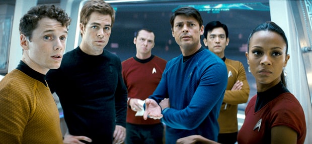
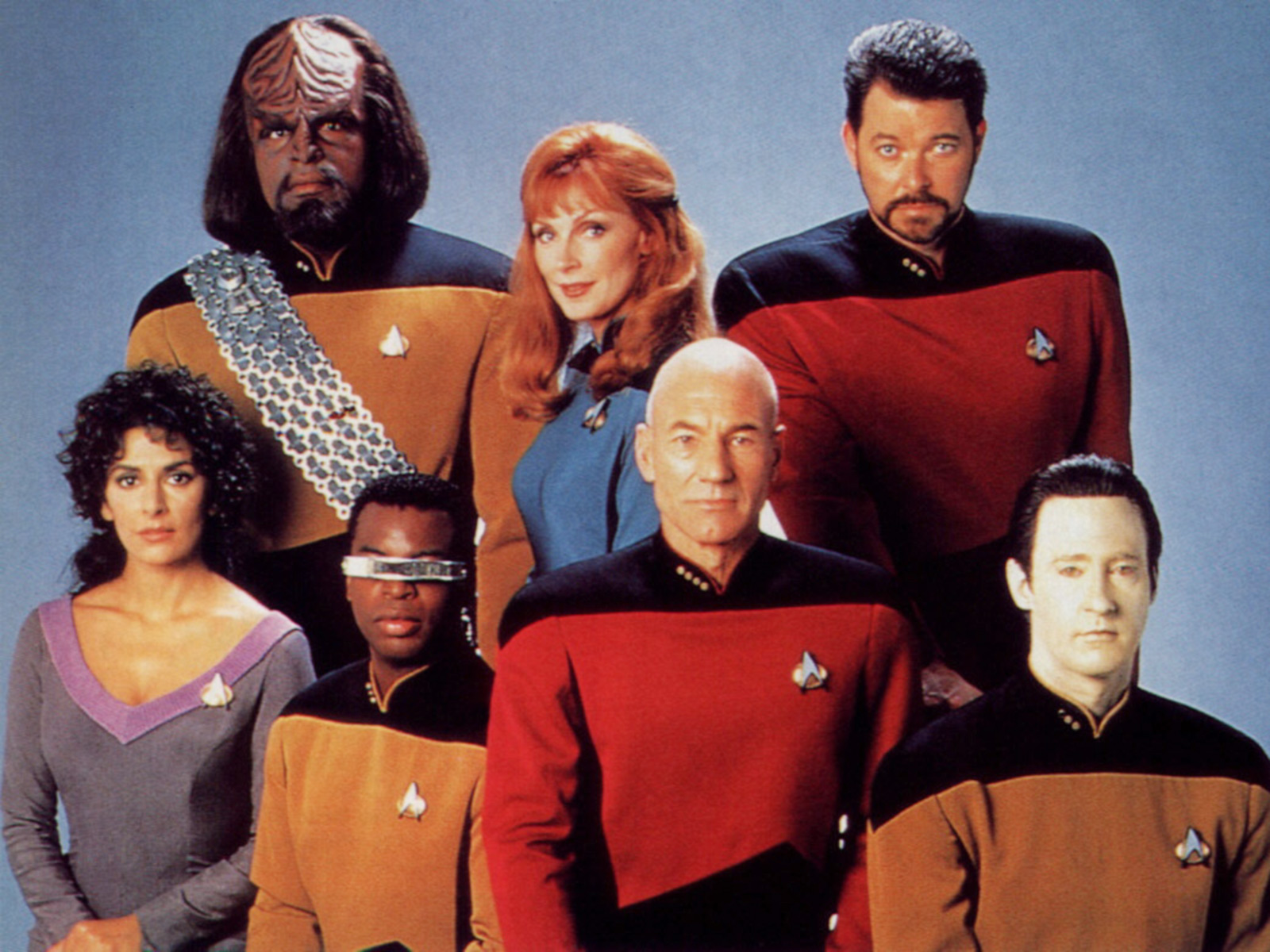
Starfleet utilizes three colors for their uniforms, red, blue, and gold/yellow. These pure primary colors that speak to the mindset of Starfleet. There isn’t time for frills and 80’s neon when you’re hurtling through space at Warp 8. By keeping the uniforms palette simple, Starfleet pays homage to its military roots while showing its bright future with easy to digest pops of color that designate a wearer's career.

Designating the wearer’s career is the main function of a Starfleet uniform. In TOS (The Original Series) gold was reserved for command, red was for engineering and security, leaving science and medical officers with blue.  After TOS, command swapped with engineering and security while science and medical officers kept their trademark blue threads. We can easily pick out the science officers in a pack of Captains but why those colors for those specific positions?
 

Playing with the psychology of color, the theory that color impacts human behavior, we can get a peek into why Starfleet possibly made the choices it did. Let’s first break down the color meanings:

Red - Aggression, Importance, and Power

Yellow - Caution, Courage, and Inquisitiveness

Blue - Trustworthiness, Reliable, Confidence

Now, taking into account these supposed meanings, it’s easy to determine why command has bounced from red to gold and medical has stayed consistently blue. Crew members know Bones is a reliable doctor, even when he’s not asserting that point to Kirk because they’ve been conditioned to trust the blue uniform he wears.

Redshirts are known for dying frequently, a problem that plagues TOS, and when we consider that red invokes aggression and stands out more it’s easy to see why there are so many dead crewmen on the Enterprise’s roster. When we move to TNG (The Next Generation), we can see that Starfleet learned from this mistake by using a darker shade of red and placing the color on crew members who have roles of power and importance. Shifting the moving targets to officers who can hold their own and limiting the body count.

While security officers enjoy the hesitation their cautious yellow brings on trigger happy hostiles. Further ensuring they don’t become the butt of another away team joke.
 

With its simple color palette, Starfleet honors its roots, boldly goes into the future, lets us rest comfortable in our assumptions about the character of each officer due to the color they’ve earned, and even saves a bit on those all important Federation credits.    

Flexibility-Usability and the LCARS

Every Star Trek fan has that fantasy where they walk onto the bridge, their captain of choice greets them, and then they take their place behind one of the many shining consoles before them. The LCARS, Library Computer Access/Retrieval System, which made its grand appearance in the Next Generation series, has dazzled the eyes and imaginations of Trekkies every since. While the LCARS features a visually appealing look, it’s the fusion of flexibility and usability that gets it a mention in our series.

The flexibility-usability tradeoff states that as the complexity of the design increases the functionality of it decreases. Take, for instance, your handy-dandy universal remote. Now, when I was a kid we had a remote with three buttons the power, channel, and volume buttons. Or a pair of pliers when one couldn't be bothered to find the remote.

In today’s market, though, one remote can perform a myriad of functions, many of those functions we don’t even utilize. And those pliers? Well, they rarely leave the toolbox now. Every time we pick up the remote, we make ourselves suffer through a design that has flexibility but limited usability for the average television user.

Taking that knowledge and applying it to the LCARS we can determine the console design’s flexibility to usability ratio. Granted, for the average person, the console’s flexibility creates zero usability. For a trained officer, the console blends flexibility and usability to create a powerful tool specialized for the role that officer holds. 

For instance, the engineering console has all the functions necessary to perform that job as well as accounting for any future uses the engineering officers may have for the console. They won’t be hailing anyone or sending the ship into warp, though.

To ensure efficiency, Star Trek designers went for a blend of flexibility and usability that allows each division to have a specialized console. All while allowing them the freedom to handle a variety of issues from a single console.

Beautifully envisioned for the needs of a 24th Century Starfleet officer the LCARS console is quality design at work.

How to talk to your designer

The secret to getting the very best graphics for your business is learning a bit of the lingo that goes with design.  The better educated you are, the better the results will be.  Use this as a beginner’s guide. We’ll be adding to it periodically, so check back.


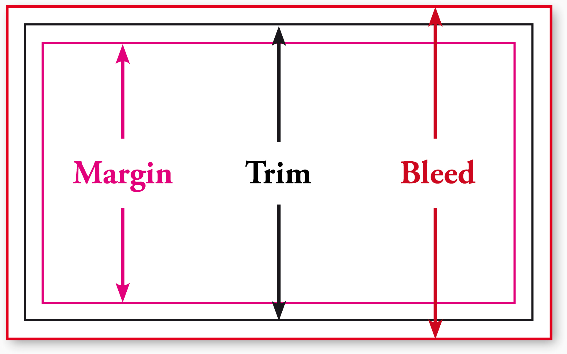
TRIM, BLEED, and MARGIN

It’s been said that trim, bleed, and margin are the most important aspects of printing instructions.  Everything else is either technical instruction or adjustments for quality.

Trim is where the product will be cut (or trimmed).

Bleed (short for full bleed margin) is a safe zone for printing outside the trim area. Suppose you want no margin between the trim and the edge of the artwork.  Because printing can be a somewhat imprecise mechanical process, the only way to achieve this reliably is to print past the place you want to cut.  Otherwise you’d have a thin white line between your artwork and the edge of the page.

Margin (also called a safety, safety zone, or safety margin) is the area on the design where graphics and text are safe from being cut off by the trim.  Mechanical printing is still a process with a margin of error (no pun intended), so the margin ensures that no content will be cut off.  


CLEAN COPY

If you’re providing copy (aka writing of any kind) to your print designer, you’ll want to provide clean copy in electronic form, such as a Microsoft Word document.

In the graphic design world, clean copy means final copy — free of typos and editing notations, as well as punctuated correctly.  Clean copy also means copy as free of formatting (e.g., different sizes, bolding, and italics) as possible.

In other words, don’t format:

  • the heads (titles) and subheads
  • indentations
  • tabs
  • lists

After your first design proof, you’ll have a chance  to format your copy, proofreading against your original copy.

Why is clean copy important?  Formatting created in word processors such as Microsoft Word can conflict with design applications like Adobe InDesign. Better to leave the designing to your graphic designers.  That is what you paid them for, right?


DISPLAY VS. BODY TYPE

Display type is any type used as a head or subhead.  Body type refers to the text that falls under a head or subhead.  Body type includes sentences and lists.  Here's a great article from fonts.com about it.

Display type is usually a different typeface from its accompanying body type.

Also, the readability of display and body type varies across media.  What’s readable on a printed page (say, a book) would usually require a serif typeface (see below), generally black text against a white page.  On a web page, readers still prefer dark text on a light page, but find sans serif body type more legible.


LOREM IPSUM

Lorem ipsum (derived from the Latin dolorem ipsum, or “pain itself”) is filler text used by designers to create a clean design.  By using placeholder text, the designers and their clients can focus on page layout, font choice, and other design decisions without being distracted by content.  


Fun fact: Often called greeking, the lorem ipsum text most commonly used today is a scrambled passage from De minibus bonorum et malorum, a first century BCE Latin text by Cicero.  A variation of the text has been used since the 1960s but became widespread in the 1980s when the Aldus Corporation introduced the first professional design program, PageMaker.

If you need some lorem ipsum you can generate it here at the Designer’s Toolbox.


RASTER V. VECTOR IMAGES


Briefly put, raster images are comprised of pixels.  Vector images are mathematical calculations.

What does this mean for you?  Raster images are exactly the size originally created.  A raster image can be made smaller, but not larger.  Vector images can be resized to any size at all.

So why wouldn’t you want all of your images handled in a vector application such as Adobe Illustrator?  Easy—you can create rich and detailed images with raster graphics.

Theoretically, every pixel in an image (such as a photograph) can be a different color.  Also, almost any application can work with a raster file.  One of the most popular, Adobe Photoshop, also makes creating .jpgs, .gifs, .pngs and other formats really easy.

Ideally, you want your corporate identity graphics created in a vector application such as Adobe Illustrator, so that you can resize them when needed for banners, billboards, and virtually any other use.

Raster images can be converted to vector images, but it’s really better and cheaper to have your artwork created right the first time.


SERIF AND SANS SERIF TYPE

The short definition of serif type is that it has a horizontal stroke at the base and tops of certain letters.  For hundreds of years, serif typography was the only typography.  It wasn’t until the 19th century that sans serif (literally, without footer) became widespread.

Perhaps the best-known serif typeface is Helvetica, although there are thousands to choose from.


The clamor for social relevance rocks on

Once upon a time, a business’s social relevance … wasn’t so important.  If you had a poor experience, or didn’t like something about a company’s practices, the best solution was to start a rumor or report the company to the Better Business Bureau.

Today, a negative review of a company’s environmental practices can cost a company its reputation, at least in the short term.

So let’s take a look at what’s happened recently in the mad rush for social relevance.

Pirelli

Problem

Tire manufacturer Pirelli’s intent was to boost tire sales.  Consultants no doubt convinced them that the best way to sell more tires was to make people really like the company.  Maybe Pirelli realized that more women than men actually purchase tires.  Pirelli settled on its low-hanging fruit, the calendar that for most of its 42 years has sported nude women.

So, on November 30, 2015, Pirelli announced that it had made a big change in its premier print piece.

The 2016 Pirelli calendar features a baker’s dozen of black and white portraits — “women of outstanding professional, social, cultural, sporting, and artistic accomplishment,” reads the press release.  Tennis player Serena Williams is there, as is art collector and patroness Agnes Gund.  Blogger and feminist Tavi Gevinson and rock star Patti Smith.

Infamous photographer Annie Liebovitz was mentioned in the press release’s second line, even before a description of the calendar.  If you go to the website  you’ll find Pirelli has a video about the piece.

The announcement was carefully crafted to make us forget about the previous half-century of car chicks.  And the announcement was clearly a sign that Pirelli wanted to be more socially relevant.

Fly in the tire ointment

These photographs started some serious conversations.

Why was Yoko Ono snapped as a cabaret MC in shorty shorts?  Was it her choice to show off her legs?

And what’s up with the barely covered model Natalia Vodianova and her naked baby?  Comedienne and writer Amy Schumer was nearly completely nude.

Four women removed some of their clothing, but none is completely naked.  Says Liebovitz, “I wanted the pictures to show the women exactly as they are, with no pretense.”  But is one person’s lack of pretense another’s nudie calendar?

The Huffington Post (“Progress or Exploitation: What the Photos Say”) explored why these pictures may not really show the women exactly as they are.

The Huff story’s opinion is that the photos still objectify women.  And are confusing.

Huff writer Margaret Gardiner concluded by saying that change is change when it’s no longer noteworthy.  When we’ve passed a milestone and are no longer noting the change, then we have change.

The conceit of these photographs became about the photo studio itself — its backdrops, lighting, walls, all of it.  These women could have been photographed in their homes, doing their work, with their families or clients or tools of the trade.

But someone thought that these women needed to present a level playing field.  That comparing one’s mansion to another’s rent-controlled flat as a background would be unfair.  Or too complicated to execute.

In the end, the women themselves were for the most part conventionally attractive.  They were shot by one of America’s most famous photographers, in a highly stylized way that divorces them from their environment, far from their accomplishments.

So how much has changed?

But was it a success?

The calendar been applauded far and wide.  But not all of the press was good.  The public discussion has sparked some heated discussion about photography, women, and objectification, and that’s almost always a good thing.  

I Love Ugly

I Love Ugly sought social relevance by shooting naked women whose private parts were covered by men’s hands.

The images probably did raise the bar for social relevance vis a vis nudie calendars.   The photography, costuming (cowboy shirts, mostly), and men’s jewelry created a tactile effect that few marketing photographs achieve.

The calendar announcement, made the day after Pirelli’s calendar release, drew immediate fire.

Rae Duff, president for the National Council of Women for New Zealand, blasted the campaign: “[The calendar] reflects how too often women in our society are seen as merely sexual objects and this feeds into our culture of abuse and violence against women.  As a brand that targets young men, they should be doing more to promote healthy attitudes.”

But were I Love Ugly’s pics reflecting relations with consenting adults?  I believe there’s an argument that the calendar does not promote a culture of abuse and violence against women any more than Pirelli’s new calendar does.

Does skin sell?

There’s still plenty of beef- and cheesecake in advertising.  Look at Dolce & Gabbana’s print ads.  A sinewy, tanned, shirtless man drifting around in a rowboat in the middle of a Mediterranean bay is a sex object, isn’t he?

Perhaps I Love Ugly could have avoided showing women’s nipples, but I’m still not sure the company has done anything worse than Snickers, Tom Ford for Men, or Budweiser, among others.

  1. Snickers ad that suggests eating chocolate will help you remove your girlfriend’s bra.
  2. Compare this phallic, breastacular Tom Ford ad to I Love Ugly’s ad, which boosted sales of Tom Ford for Men cologne.
  3. Photography marketing has always had a thing for ta-tas.
  4. Breasts seemed to sell Bud Light Lime, with the help of Arlanny Celeste.
  5. And of course there’s Hooters.

A recent study in Advertising & Society Review found that 20 percent of all magazine and web ads use sexual images, although it’s debatable whether the use of breasts in advertising actually help or hinder sales, because people (61 percent) can’t seem to recall the brand that used them.

Et tu, Playboy?

Yes, Playboy has been cleaning house as well.

Even though the magazine has historically carried some of the magazine world’s most astute editorial content, its name had become synonymous with pornography.

In October 2015, Playboy — the world’s most famous nudie magazine — pledged to end nudity on its pages. Even the centerfold.

Why do companies make the decisions they do?

We always have to follow the money.

Playboy used to circulate 5.6 million but circulation today is less than 100,000.  Its target audience was men in their late 40s, but after its redesign without nudity, the average dropped to 30.  Plus, its web traffic zoomed from four million to about 16 million unique users each month.

Just one small change has made the magazine more relevant to a broader audience.   Plus, its cover won’t have to be hidden on the newsstands.

Mattel

How could Barbie, the classic icon of cheesecake, objectification, and subservience, be socially relevant?

If it’s the likeness of the award-winning filmmaker of the Oscar-nominated “Selma,” Ava DuVernay.

Mattel released this latest Barbie installment on December 7, 2015.  The dolls were sold out on both Mattel’s and Amazon’s sites within 17 minutes.  Each doll came with her own director’s chair.
 

barb

What is just as cool as having a doll you can look up to?  Donating all of the proceeds to nonprofit organizations Color of Change and Witness.

Mattel created the dolls for its line of Sheroes Barbie dolls.

Now that’s social relevance that works. It’s not sudden conscience disguised as social relevance.

How to be socially relevant

You have to make your ad absolutely relevant to your audience.  Not to some of your audience.  To all of your audience.  And you have to keep that engagement going — from television ad to website to print collateral.

To be socially relevant, you also need show good taste and propriety now more than ever.  In early advertising, it was acceptable to make ads relevant primarily to men, often the breadwinners and decision makers.  As a result, women were subservient and domestic.  They were also guilty if they allowed “ring around the collar” — not the man who didn’t bathe.

Today, women are the primary decision makers for large-ticket items such as houses and cars, home repairs and appliances.   

No matter who your target audience is, you still need to make people feel.  Marketing and advertising are emotionally driven messages.  So you need to know your audience(s) inside and out, be able to surprise and delight them, and convince them to buy your product or service.

Sexiness has been a large part of marketing for many years.  And yet … how to be sexy at no one’s expense?

Marketers are jockeying to find just the right mix of sexuality and good taste.  And, of course, there are other ways to reach consumers:  humor, beauty, surprise, loyalty, and many more.

What the companies in this essay have shown us is that taking a new look at a product’s audiences often yields a bonus for the consumer and for the company’s bottom line.